
Overview
Analytics tools are crucial for SaaS companies to make smart decisions and stay competitive. With more small SaaS businesses and solopreneurs entering the market, the demand for accessible, user-friendly analytics solutions is growing.
Problem
Popular tools like ChartMogul and Baremetrics are often too complex and expensive for smaller teams, making it difficult to leverage data effectively. To fill this gap, we created Dream Charts, a simple, user-friendly analytics tool designed for small SaaS businesses and individual entrepreneurs.
Role
Product Designer
Skills
User Research
Visual Design
Interaction Design
Product Strategy

Prototype
01
Current market offerings
The analysis shows that ChartMogul, Baremetrics, and ProfitWell, popular among large SaaS companies for their advanced features, are often too costly and complex for smaller firms and solopreneurs. This gap in the market suggests a great opportunity for a new tool.


02
Addressing market gaps
Based on the analysis of subscription analytics platforms above, there are several market gaps that Dream Charts could potentially fill:
Providing a streamlined, intuitive interface that simplifies access to essential metrics and insights.
Offering a more affordable pricing structure suitable for smaller budgets.
Enhancing dashboard customization, data visualization, and reporting for small SaaS companies and solopreneurs.
03
Target user profile
Who will benefit from Dream Charts:

01
Identifying key metrics
After consulting with two mid-sized startup co-founders and gathering insights from Twitter, Product Hunt, and solopreneurs, I've identified the essential metrics.

02
Dashboard design exploration
I aimed to embody simplicity and minimalism while focusing on the essential key metrics. The goal was to create an intuitive and streamlined interface that provides clear and immediate insights in a single-page, non-scrollable dashboard.

03
Analytics design exploration
I explored intuitive ways to present all available metrics and data, ensuring users can easily access and understand key insights within the Analytics tab. The focus was on simplicity, clarity, and usability.

04
User testing
Feedback from 2 startup co-founders revealed that they want to have:
Flexibility to manage multiple projects under 1 account.
Be able to access all metrics for specific subscription plan.
Having a customizable dashboard (no need for a single-screen dashboard).
05
Dashboard usability improvements
The customizable dashboard similarly to Apple Widgets, allowing users to easily adjust layout and metric sizes: Small, Medium, or Large.


The solution
The SaaS analytics tool features a modern, trustworthy, and welcoming design, making tracking business metrics as simple and enjoyable as checking views on a trending TikTok video.
01
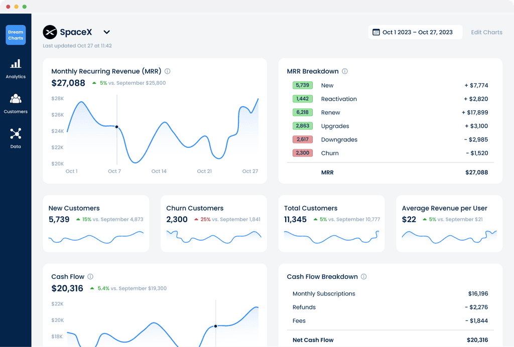
Main Dashboard
With an intuitive layout, users can easily select projects, customize their dashboard, and adjust metric sizes—Small, Medium, or Large—for the right level of detail, all without special training or complex setup.
02
Analytics
Metrics have been thoughtfully grouped and selected based on their importance to users. You can customize your page by removing or rearranging metrics according to your preferences.
03
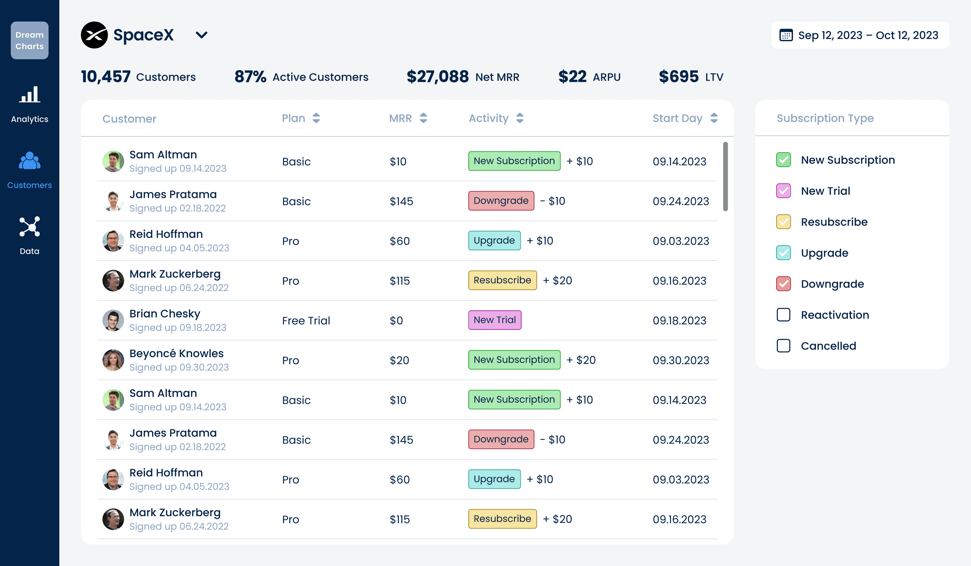
Customers
Organize customers by plan, MRR, activity, and more, with key analytics built into the dashboard for easy insights.
Reflections
Working on a subscription-based analytics tool was a completely new experience for me. I dedicated significant time to understanding user needs, usage patterns, the value of each metric, and identifying opportunities for improvement in the analytics tools market.
Over 70% of users have rearranged or resized their dashboard widgets (Small, Medium, or Large), proving that our customization feature is a core value proposition.
Users report a 50% reduction in time to gain key business insights compared to manual analytics setups, underscoring the tool’s efficiency.
Approximately 80% of users regularly use the advanced filtering options (by plan, MRR, activity), indicating that our feature grouping resonates with customer needs.
Our post-launch SUS survey averaged an 84, well above the industry benchmark, highlighting the tool’s modern, trustworthy, and welcoming design