Overview
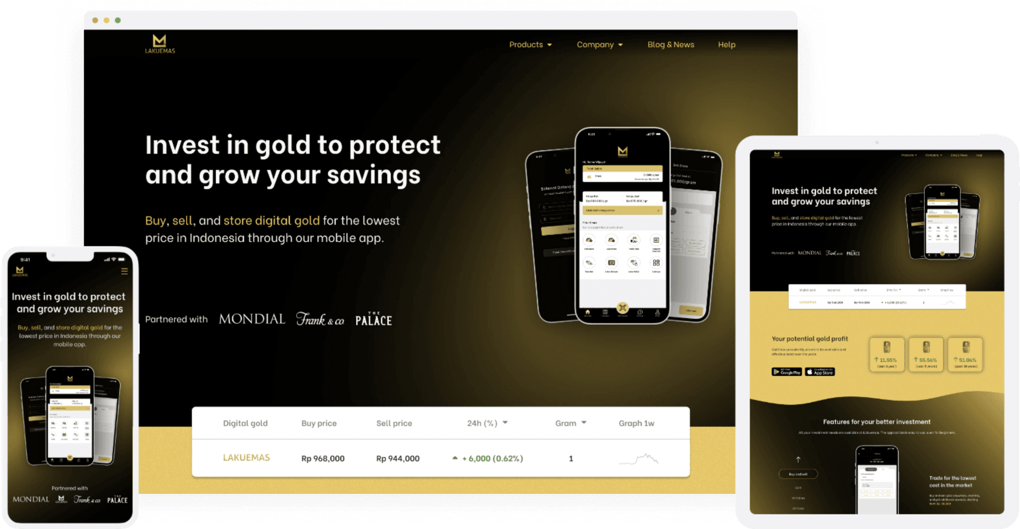
Lakuemas is a mobile app that modernizes digital gold investing, combining the stability of traditional gold with the ease of digital access. Backed by Central Mega Kencana (CMK), Southeast Asia’s largest jewelry conglomerate, it aims to make gold a go-to investment for younger Indonesians. As a contract Product Designer, I collaborated with the CEO, marketing, and engineering teams. I worked on rebranding and redesigning their website to educate first-time investors and promote digital gold.
Problem
Despite 500K+ app downloads driven by TikTok influencer partnerships, Lakuemas struggled with low conversion from organic web traffic. An outdated, unclear website left many visitors disengaged, missing a key opportunity to convert them into users.
Role
Product Designer
Consultant
Skills
User Research
Visual Design
Interaction Design
Product Strategy
Prototype
Lakuemas website before
A sketchy, text-heavy, inconsistent, and illogical design creates an untrustworthy and confusing website, preventing customers from understanding the product. This frustrating experience leaves them with an unpleasant memory, ensuring they never come back.
01
Market research
Before starting the design process, I analyzed competitors to understand the gold investment market. Established players rely on government backing and outdated web-only designs, while newer competitors focus on minimalistic interfaces but lack detailed information and mobile support. These insights helped identify market gaps and opportunities.
02
User research
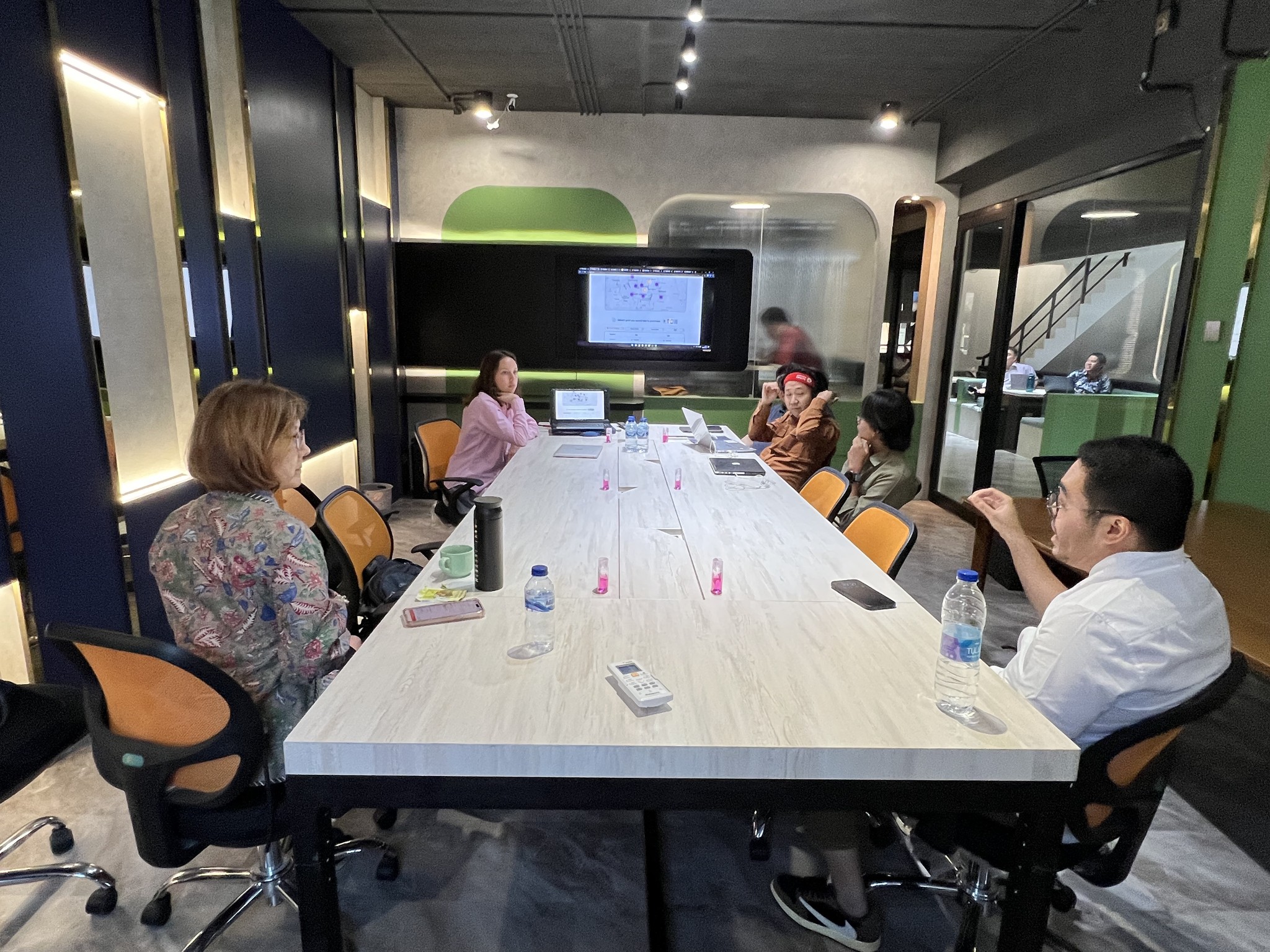
The next step in my design process was understanding our potential customers’ pain points and validating the hypothesis. To do this, we partnered with 25 existing customers, who served as our design partners.
03
Understanding their problems
Most customers seek trust confirmation and assurance that digital gold has real value and security. First-time investors, in particular, need simple guidance on why and how to invest. Interview themes:
04
Analyzing customer behavior
Indonesian consumers value brand identity and reputation. To stand out in the competitive gold investment market, Lakuemas must focus on building trust.
However, a lack of clear brand identity, sketchy design, and an outdated, non-responsive layout has led to 98% of mobile users leaving the website within 5–10 seconds.
98%
Indonesians research brands on their phones, with 80% changing their purchase decisions after consulting their devices.
25mb/s
Is the average internet speed, that is why designers and developers should prioritize optimizing websites.
3sec
More than half of mobile visitors will leave a website if it takes more than 3 seconds to load.
05
Existing user journey
Overwhelmed by cluttered promotions, text-heavy presentations, and unclear explanations, customers remain uncertain of the app's purpose.
From research to strategy
Clarify Lakuemas's role as a digital gold investment app directly on the homepage.
Add a clear call-to-action button for easier navigation and app download.
Redesign the website for a more professional and trustworthy look.
Offer a brief, interactive overview of key features and products.
Enhance transparency with detailed information on operations and trust factors, making the site more user-friendly.
01
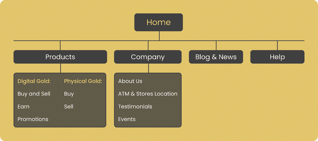
Improving navigation
Previous user interviews showed that confused visitors couldn't understand what Lakuemas is from the homepage and due to illogical and unintuitive navigation menu failed to find any clarity despite exploring other pages.
Fixing existing issues
The updated navigation system has become easier and more intuitive. The "Product" and "Sell Gold" sections are now grouped together, with subgroupings for digital and physical gold to enhance clarity. Confusing feature names have been replaced with clear descriptions.
02
Designing layout
After understanding our customers priorities and preferences, I created a layout plan for the Homepage. This plan ensures that it contains essential elements in a logical order to meet our users' needs:
1.
A clear description of the product and its functionalities.
2.
The current gold price.
3.
Benefits of investing in Lakuemas digital gold.
4.
Step-by-step instructions on how to invest.
5.
A social proof of positive experiences with the service.
6.
Evidence of Lakuemas's credibility, professionalism, and legitimacy.
03
User testing
We tested these wireframes on 25 users, and received both positive and negative feedback, which we implemented in the final design:
01
Developing brand identity
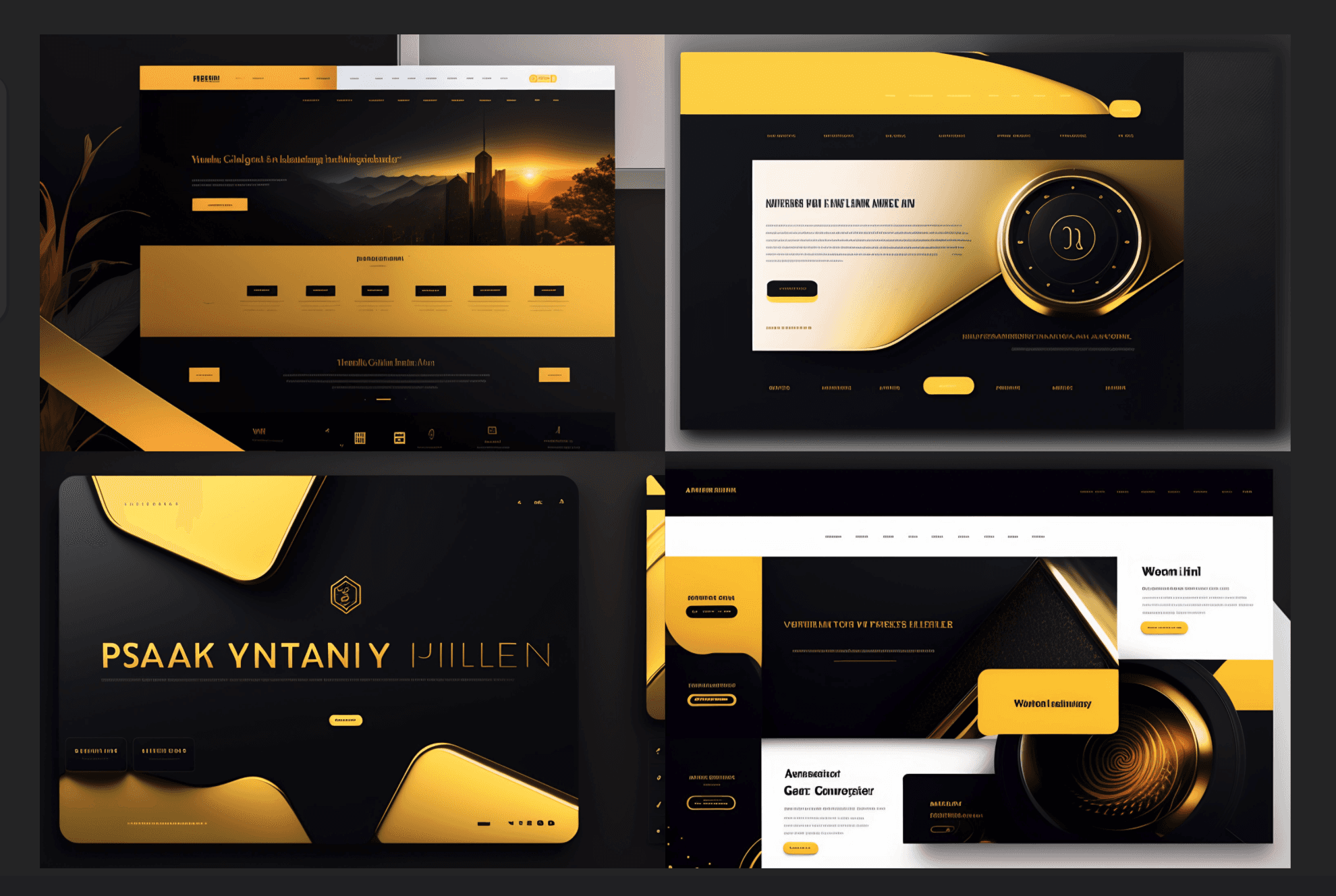
After testing the layout, it was time to create the brand's visual language, including typography, iconography, color schemes, and imagery. Concept ideas:
02
Designing navigation
To further clarify the purpose of each section, I added a brief description underneath each one.
03
Designing the Homepage
The Lakuemas homepage redesign provides an interactive experience that centers on user inquiries regarding its identity, functionality, and trust factors through modern design and clear messaging.
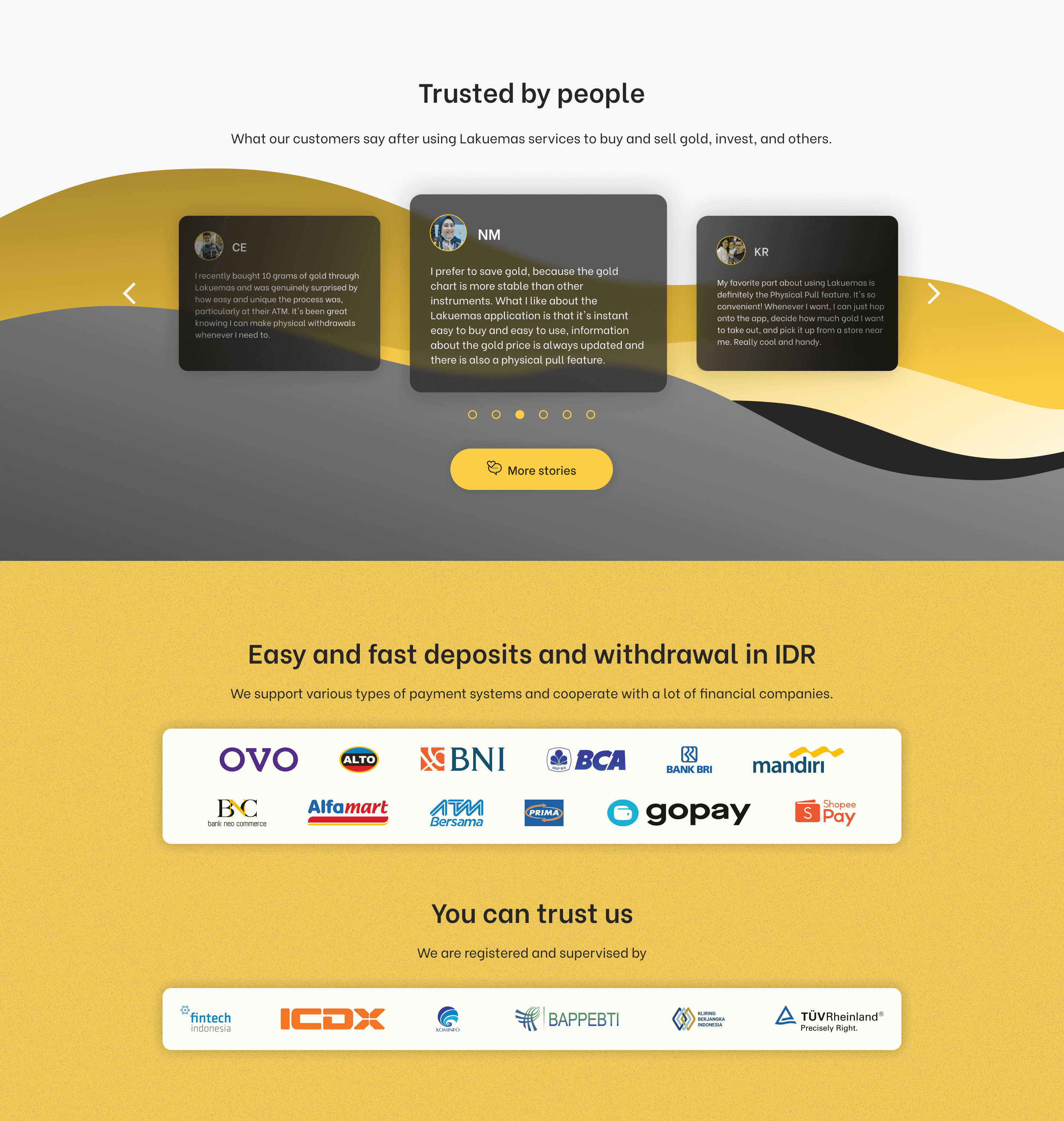
It explains why investing in digital gold is beneficial, supported by actionable insights and visual guides, including screenshots and video tutorials, for ease of use. Credibility is improved by showcasing social proof, certifications, and partnerships, effectively addressing user concerns and engaging new users.
Before
After
04
Designing product pages
The product pages, which offer details on Lakuemas's main purposes and functions, needed restructuring. We compiled information from previous pages, ensuring it was more logical, comprehensive, and interactive, while also making it simpler and visually appealing.
Before
After
Reflections
Starting my first project in Indonesia, I quickly learned that assumptions about new markets lead to misjudgments. To avoid this, I researched Southeast Asian design trends, mobile habits, and cultural nuances.
This deep dive helped create a design that resonated with our audience, something many competitors overlooked. Curiosity and continuous learning were key to ensuring our redesign was both visually appealing and culturally relevant.

